Back to main portfolio
Case study
UI / UX redesign of Parqueo Positivo App
Application for paying parking meters in Guayaquil and Samborondón, Ecuador.
This project was born out of a personal concern to explore improvements in the interface and user experience of an application that many of us use in the city. As part of the initiative, it included consulting other people about their experience with the app, to go beyond my personal perception.
Learn more about Parqueo Positivo.
Case
There are subjective (and not so subjective) improvements that I can suggest in terms of the visual aspect, but there are others, in the field of user experience, that are hard to overlook and are related to:
- Difficulty in finding functions.
- Slowness and lack of user-friendliness.
- Issues with reliability and incorrect fines.
- Inconsistencies in the payment process, among others.
Goals
To create a renewed, functional design that addresses the identified issues.
My role
Research, design, and prototyping.
Discovery
Research method
- Surveys online (Twitter, LinkedIn)
- Surveys offline
Twitter feedback received
Between May 22nd and May 28rd, 2023 - 🔗 link to conversation
"Mal UX pero funciona. Tienes una prueba que has pagado y puedes pagar extra por más tiempo a la distancia"
Nuno Acosta
"Contraté 3 horas en la app. Dejé auto estacionado. Al parecer no aparecieron en el dispositivo de los guardias de la empresa... como el parquímetro marcaba cero... me pusieron una multa. Las monedas son confiables; su app no lo es."
Andres Seminario
"La herramienta es útil porque cumple su cometido, pero es difícil usarla. Las placas que uno agrega se borran frecuentemente y por como está concebida, pareciera que la consulta en línea toma demasiado tiempo. La otra cosa es que el saldo debería servir tanto para GYE o SAMBO."
Paul Estrella
"- Cuando haces una recarga de saldo, muchas veces no se registra inmediatamente. Tienes que recargar con mucha anticipación o ya ir llevando monedas. - Eso del saldo para cada cantón me parece absurdo, siendo la misma empresa que recauda. - Se buggea con frecuencia."
Pame!
"Si.. confusa, reiterativa, cumple pero deficientemente."
Andrea Cascante
"La uso siempre! Pero por alguna extraña razon, no registra mi placa y tengo que ponerla cada vez q voy a hacer un pago. A veces tb se buggea. "
Dyana Pombar
"Puse $10 con la tarjeta y se acreditaron dos días después. Multa segura."
Alexandra Landázuri
"Siempre la uso pero en samborondon. Nunca la he usado en guayaquil. Para mi es excelente."
Ma. Fernanda Alvarado
"Por mi lado excelente."
Juan Pablo Meneses
"Cumple con su cometido, UI terrible..."
Gerardo Almeida
"Cero confiabilidad. Te pueden multar aunque hayas pagado."
Luis HANNA Nader
"Excelente."
Arturo Arce
"Es una buena idea pero con la ejecución más terrible. Difícil de entender, donde encontrar las cosas y es leeenta, para no morirme de coraje sigo poniendo monedas en los parquímetros de puerto santa Ana y urdesa."
Francisco Vargas
"Desastrosa en usabilidad. Realizar pago y modificar pago, las primeras veces no encontraba dónde era. Me multaron porque pensé que ya había terminado el proceso y no era así. Falla mucho el sistema de pagos y no te avisa, luego te llega varios cargos."
Mario Crespo
"Tiene un máximo de tiempo de 4 horas. La conexión para pagar es súper lenta, a no ser que estés en el parqueadero pagando te demoras dos Minutos y un vigilante te clavo la multa el ux es desastroso, la recarga es desastrosa, lento y poco funcional."
Hector Daniel Galarza
"La he usado un par de veces. La interfaz deja mucho que desear, no es nada amigable intuitiva. Lo que más me preocupa es qué hay que recargar saldo. Me preocupa que se estén captando fondos sin autorización. Debería pagarse sin necesidad de recargar “saldo”"
Papachucho
"Worst app ever, projects disdain and inconmensurable hate of customers. Implements every imaginable worst practice in UX design. Payment functions don’t work, crashes and blocks you from logging in. This app is one of the most unpleasant parts of my stay in this beautiful city."
Alpha raccoon
"Funciona muy bien."
MKoenig
"Es lento hay que aplastar varias veces para q reaccione, pero no esta mal es una buena solución."
Gilda Valle
"Creo q. La pueden hacer más práctica 👌 e intuitiva 👍"
Luis Alberto Vásquez
Findings
The following are the relevant findings regarding users' experience with the application and provide a solid foundation for identifying areas of improvement:
- Poor user experience: Several users mention that the application has a bad user experience (UX) and is difficult to use. Issues such as difficulty in finding functions, slowness, and lack of user-friendliness are reported.
- Functionality fulfilled but with difficulties: Although the application fulfills its main purpose, which is to allow parking payment, several users mention associated difficulties. Some report that the vehicle plates are frequently erased, requiring re-entering them for each payment. Additionally, it is mentioned that online inquiries take a long time and the connection for payment is slow.
- Reliability issues and incorrect fines: Some users express a lack of trust in the application as they mention that despite making the payment, they can still receive fines. It is also mentioned that balance top-ups are not immediately registered, and it is necessary to recharge in advance or carry coins as an alternative.
- Inconsistencies in the payment process: Problems with the payment system are mentioned, such as frequent failures, lack of notifications, and the arrival of multiple charges without prior notice. This generates confusion and frustration among users.
- Positive feedback and frequent usage: Despite the mentioned difficulties and issues, some users appreciate the usefulness of the application and use it frequently. These users highlight that the application fulfills its main function.
UX / UI design
Starting point
These are the screens from the current App.
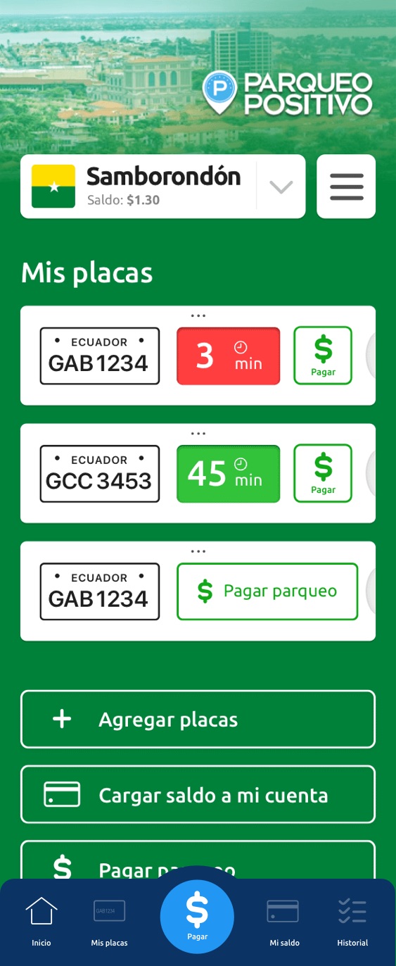
Home screen
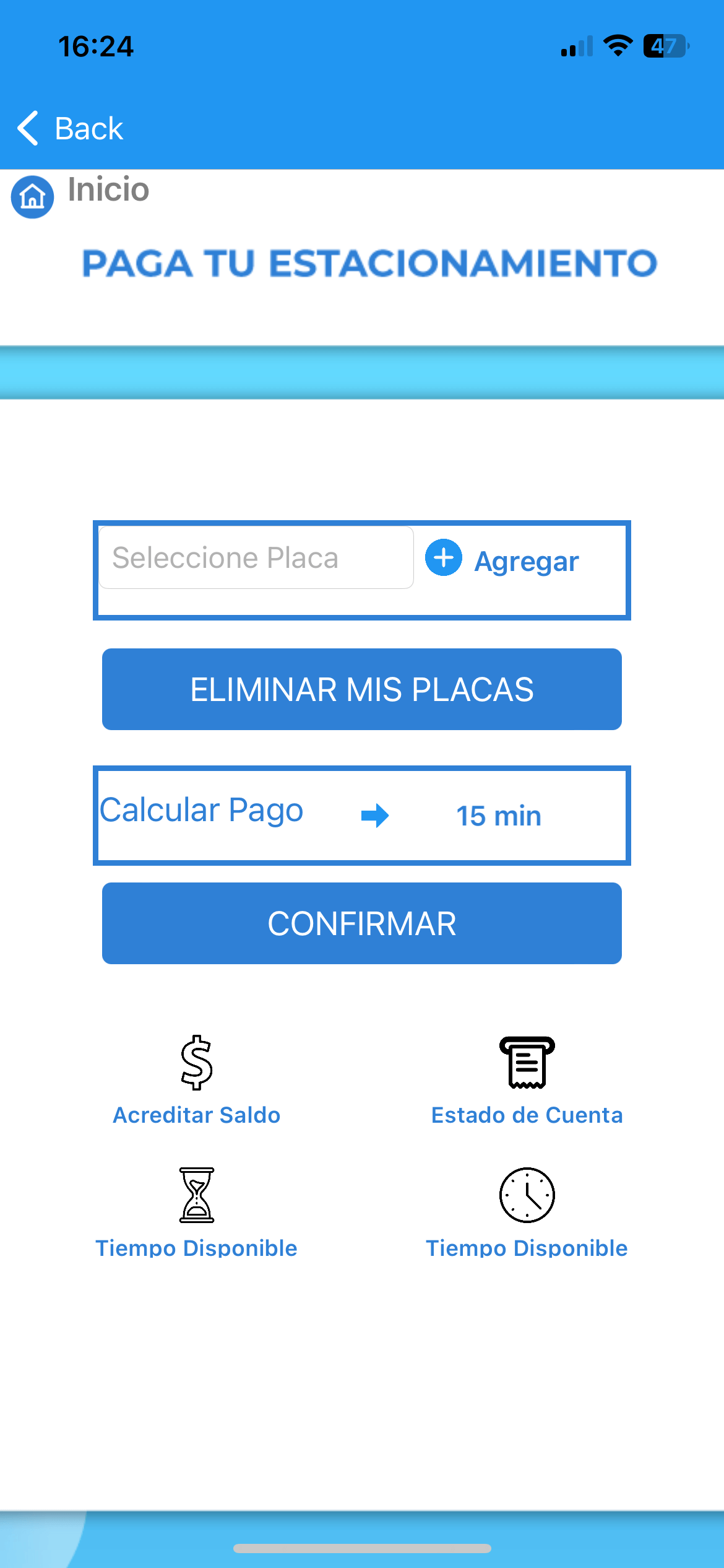
Paying for parking
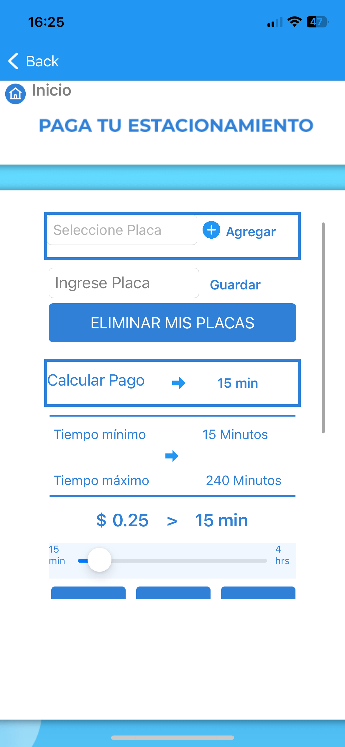
Paying for parking
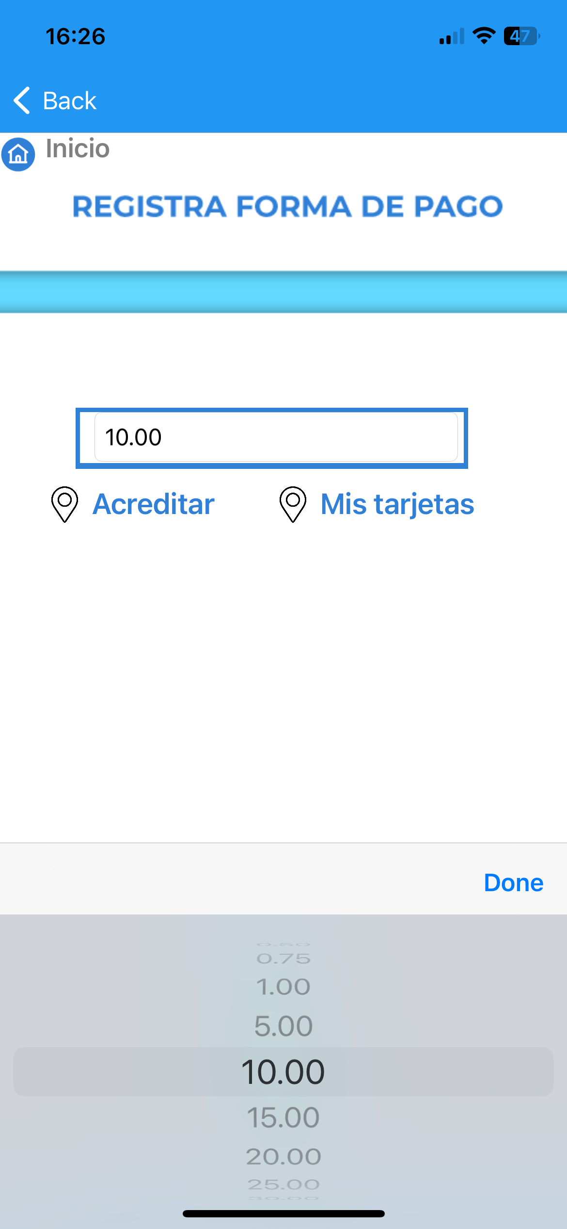
Adding new card
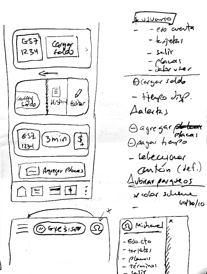
Sketching
An initial approach to the new interface.
First design iteration
Some initial issues that were addressed:
- Improve usability for adding money for a license plate (pay the parking meter).
- Changing location
- Redesign the interface to align with usability and user experience.
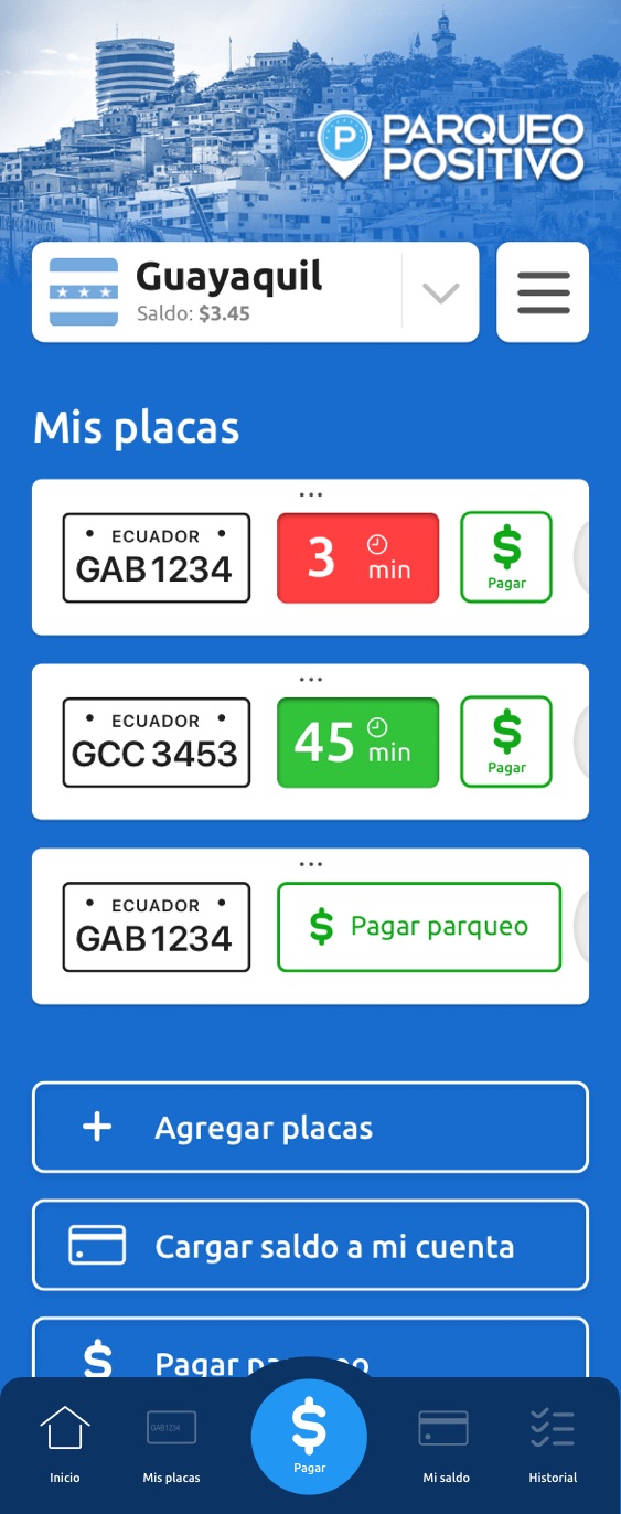
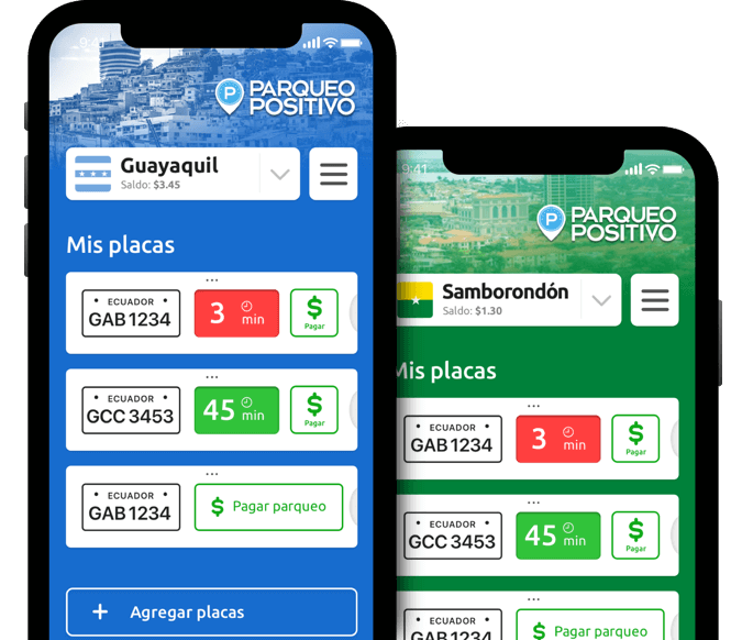
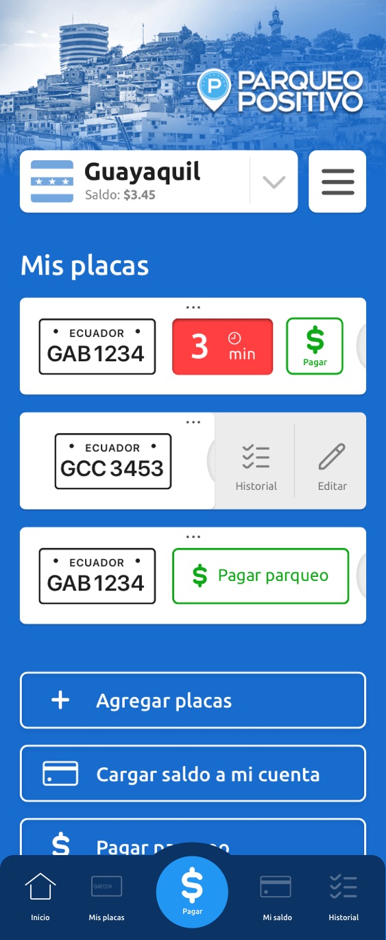
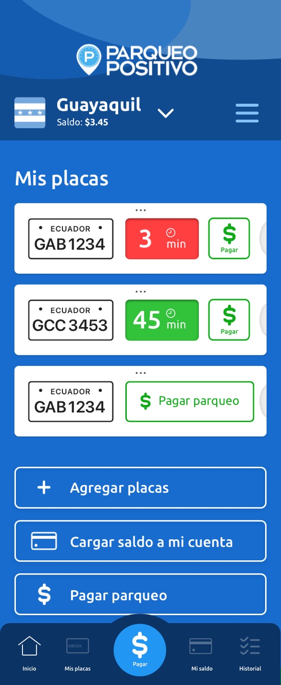
Home screen
Gesture slide reveals more options
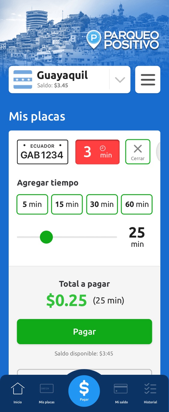
Adding money to a plate (paying for parking)
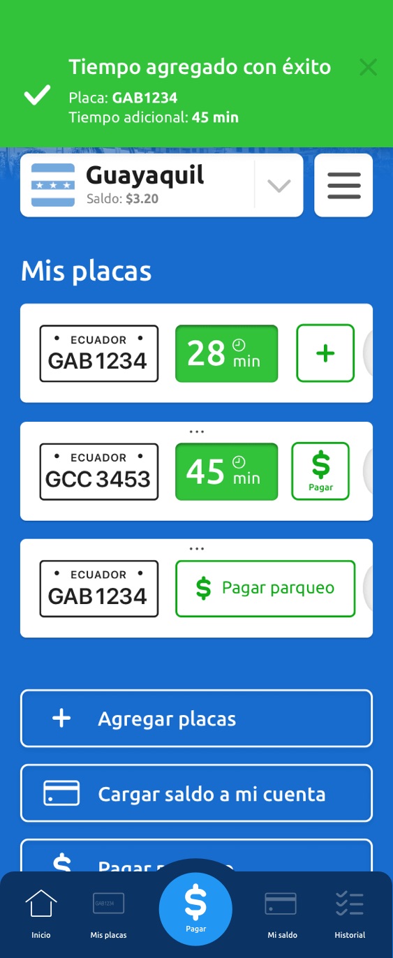
Confirmation of payment
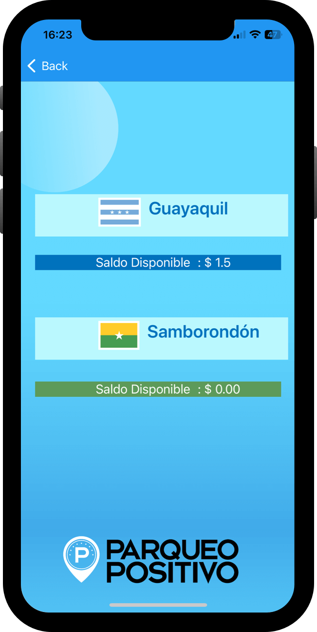
Alternate version of home screen
Selection of second city (has its own representative color)

Check out the prototype created with Sketch and Invision:
📲 Invision prototype online
Please use the password: positivoux
Learnings
Although this was a personal project not connected commercially with the App or the brand, it was rewarding to see the feedback from actual people that use it daily.
I enjoyed exploring and designing a new UI that could well replace the current one as a more usable alternative, since it’s based on my personal experience as a UX designer and the feedback of real users.
Back to main portfolio